In the age of big data, dealing with large high dimensional data is not uncommon. Data with with 100+ features can be useful for creating predictive models but creating graphs to present the structure of the data can be challenging.
Techniques from an area of machine learning called manifold learning can help to map high dimensional data into low dimensions while preserving most of the structure of the data. One of the most commonly used nonlinear dimensionality reduction technique is TSNE.
TSNE (t-Distributed Stochastic Neighbor Embedding) attempts to map points in n-dimensions onto a 2 or 3 dimension by maximizing the similarity between the high dimension and low dimension. It's works by converting the euclidean distance into probabilities of the nearby points using the Gaussian density.
The formula for calculating the similarity between data points in the n-domain is using the following equation:
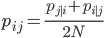
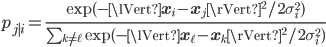
where the conditional probabilities are:
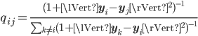
In the low dimension the similarities are calculated using the t-distribution with 1 degree of freedom. The initial values for the  and
and  are randomly set at the start of the algorithm.
and are randomly set at the start of the algorithm.
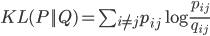
Then the algorithm minimizes the difference between these two number my minimizing Kullback Leibler divergence using gradient descent.
The equation for the KL divergence is:
On each gradient descent, values for  are updated in order to move closer to the local cost function minimum. After the algorithmn stops updating the and achieves the local minimum, the
  values can be plotted on a scatter plot and can be analyzed.
are updated in order to move closer to the local cost function minimum. After the algorithmn stops updating the and achieves the local minimum, the values can be plotted on a scatter plot and can be analyzed.
Below is an example of a TSNE projection of a wine data set. There are two classes in the wine, red wine and white wine. From looking at the graph we can see that there is a slight overlap but the features seem to naturally group the wine into separate groups. It shows that there is a natural clustering in the data.
The code to generate this image is given below.